

Back to Work
Auto Refinance Conversion Redesign
Caribou Financial
Mobile first re-architecture increasing view to submit conversion by 57%
Executive Summary
Caribou's refinance flow had been built for desktop while the majority of users were arriving on mobile. The experience was structured around a desktop session model (multi-field forms, sequential pages, and an email-based authentication step) which introduced friction at every point where mobile behavior diverged from that assumption. Organic traffic converted poorly, users dropped off before reaching offer selection, and the funnel depended heavily on partner-acquired leads to sustain submission volume.
I led strategy, system architecture, and cross-functional alignment across design, engineering, analytics, compliance, and legal. The redesign introduced phone authentication and third-party data prefill to remove the two highest friction points, rebuilt the flow as a mobile-first wizard, and restructured the offer presentation to reduce decision load. The result was a 57% increase in view-to-submit conversion and a seven-figure projected annual revenue impact from organic traffic.
Measured Impact
Seven-figure projected annual revenue impactStrengthened sustainable organic growth as higher-converting traffic compounded across both channels.
+57% view-to-submit conversionImproved organic funnel efficiency by eliminating the primary drop-off points in the mobile flow.
+40–60% lift across partner channelsIncreased cross-channel conversion consistency by applying the same flow improvements to partner traffic.
Hundreds of incremental submissions per monthReduced reliance on partner-acquired leads by shifting volume toward a stronger organic funnel.
Overview
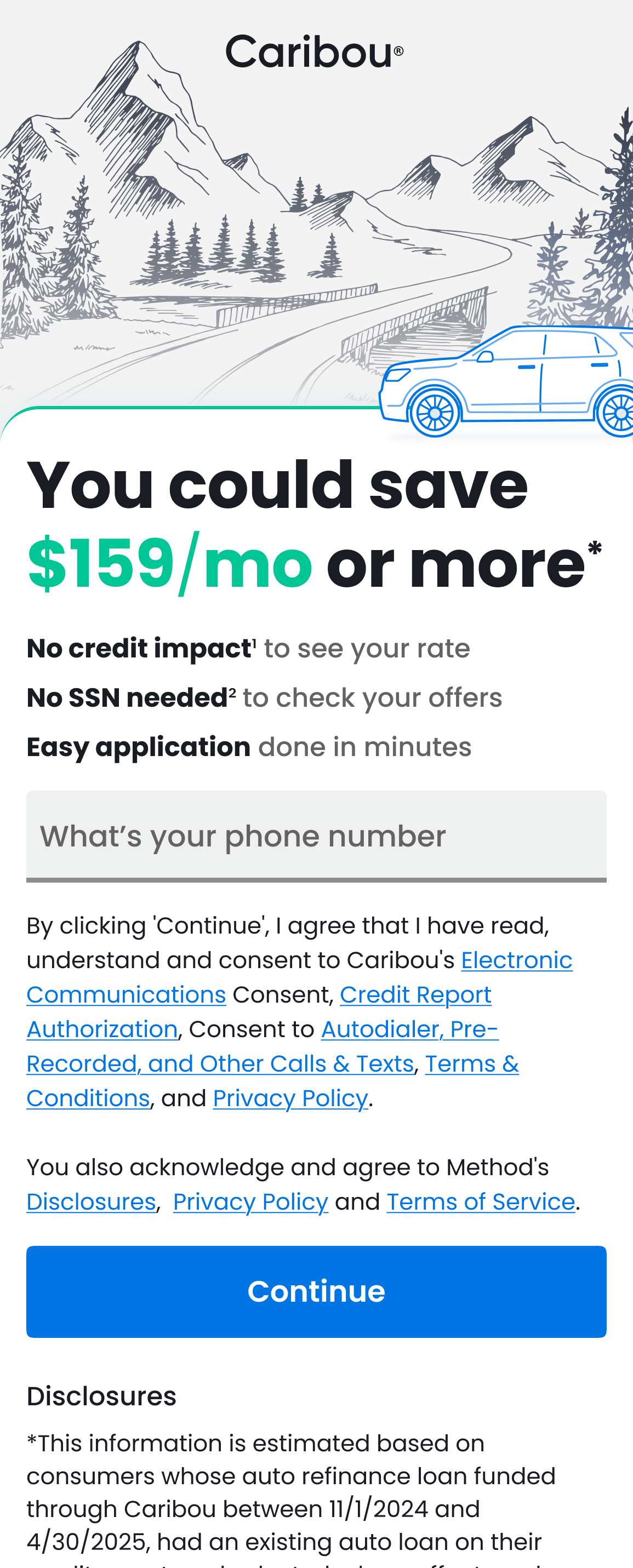
Over 80% of users arrived on mobile. The flow required excessive scrolling, frequent field switching, and an email authentication step that interrupted the session and caused drop-off before users re-entered the funnel.
The funnel also lacked prefill capability, requiring users to manually enter information that third-party data sources could supply. Combined with the email authentication interruption, this produced high abandonment rates at the identity and vehicle verification steps.
The redesign was scoped to address the mobile usability gap and the organic conversion problem as a single architectural change.
- Supported Devices: Mobile-first, full desktop support
- Timeline: Dec 2024 – Sep 2025 (MVP launched Apr 2025)
- Primary Audience: Organic search users, partner traffic, returning customers
These challenges weren't isolated symptoms - they were structurally interconnected. This table maps how each phase addressed a distinct layer of the problem:
Framing
Impact
Quantified revenue leakage and structural acquisition risk
Focus Area
Conversion Risk & Funnel Leakage
Key Signals
Home / Offers / SSN drop-offs; Partner reliance vs. organic; 80% mobile misalignment
Discovery
Impact
Identified cognitive overload, trust breakdown, and step fatigue drivers
Focus Area
Root Cause Validation
Key Signals
Analytics segmentation; Loan officer insights; User testing + competitor benchmarking
Design
Impact
Scalable, compliant, cross-channel conversion system
Focus Area
Conversion System Architecture
Key Signals
Wizard flow + progress; Variant testing at drop-offs; Pre-fill + fallback + auth trade-offs
Production
Impact
Durable infrastructure enabling sustainable growth and future AI extensibility
Focus Area
Platform Operationalization
Key Signals
MVP launch + QE; Rails + React-Bootstrap alignment; API dependency + design system + debt reduction
Discovery
Research & Synthesis
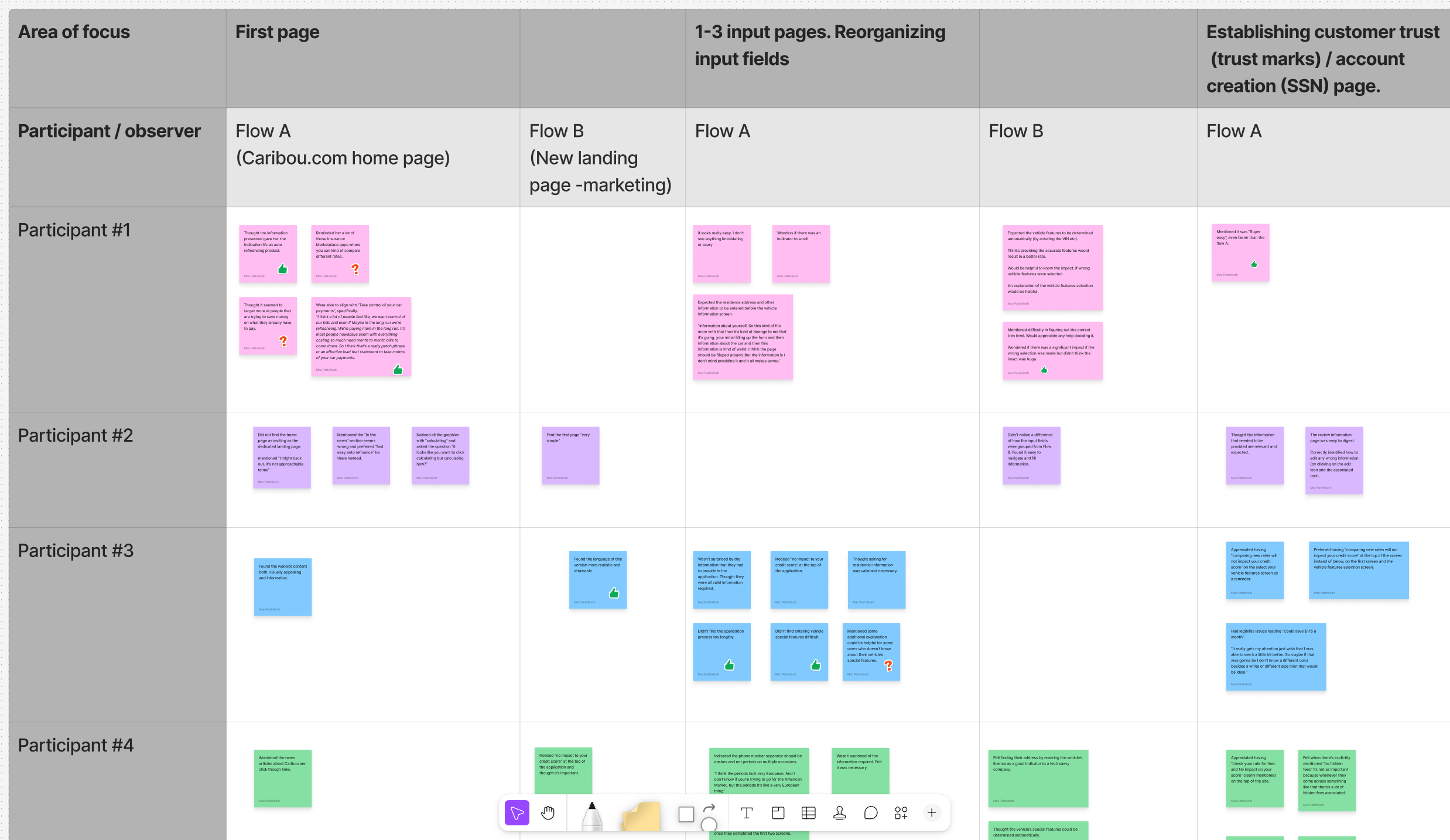
In collaboration with the project manager, I conducted user interviews with participants who had recent refinance experience to understand motivations, expectations, and financial decision-making behavior. The interviews revealed higher financial literacy than anticipated. Users arrived with rate and term awareness and were not relying on the flow for education. This finding supported removing explanatory copy and tooltips that added length without adding value for the actual audience.
Analytics segmentation identified three primary drop-off points: the landing page before form entry, the identity verification step, and the offer selection page. Loan officer interviews confirmed that users who reached agents were frequently asking questions that the flow should have preempted, pointing to information hierarchy problems rather than comprehension gaps.
Flow Variant Analysis
I tested flow variations across landing page structure, offer and product presentation, and review page inclusion. Competitive benchmarking surfaced a consistent pattern in higher-converting flows: removal of progress bars and trust mark clusters. Testing confirmed this held for Caribou's audience. Both elements anchored user attention to process length and complexity rather than forward momentum, adding friction for users who had already decided to apply. Both were removed despite their presence in standard conversion conventions.
UX Flow Workshop
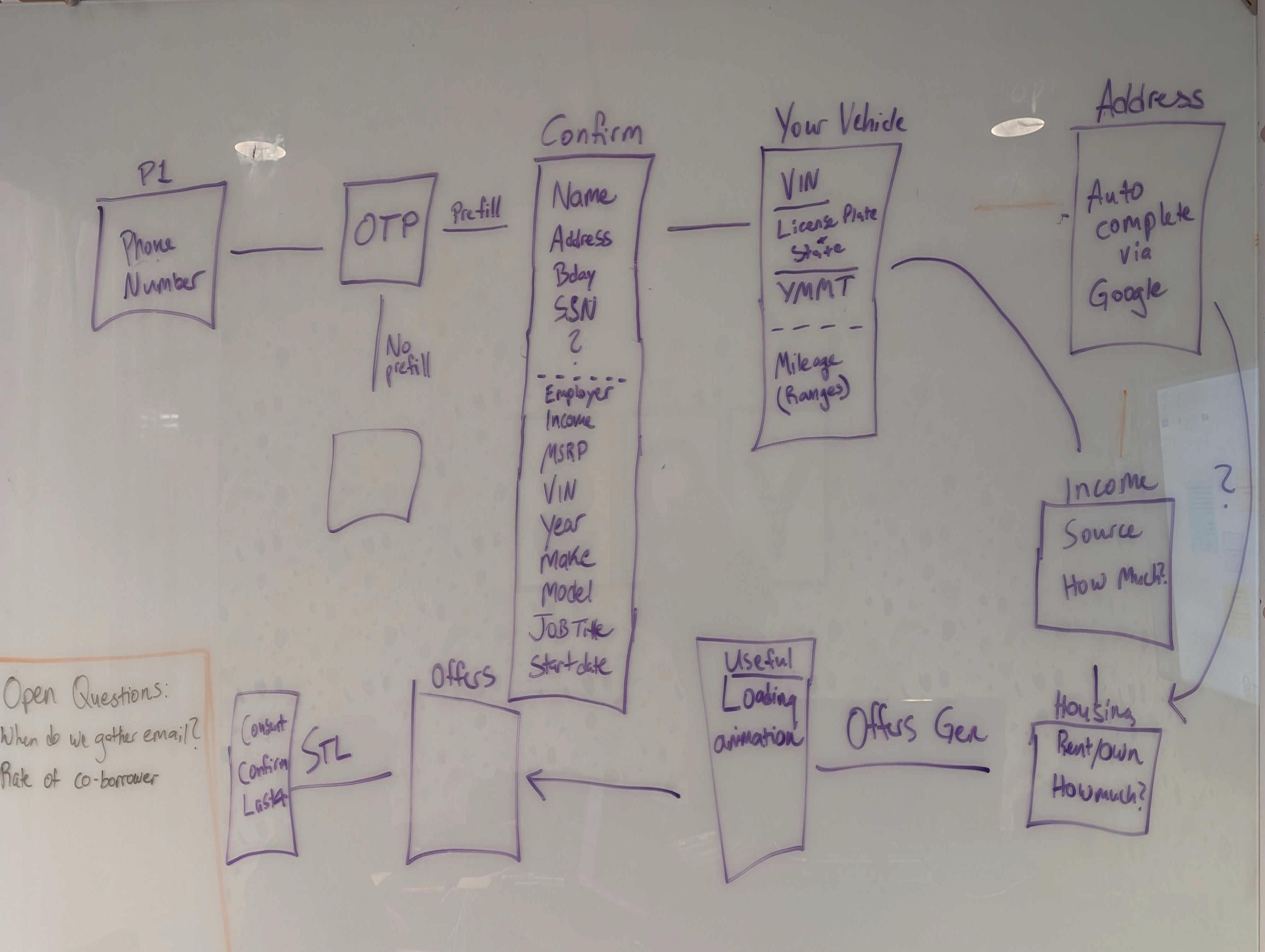
I facilitated a whiteboarding session with the VP of Product to map the end-to-end flow, data requirements, prefill logic, and fallback paths. The session translated research findings into a streamlined architecture and established the wizard-based flow structure, phone authentication entry point, and prefill-with-fallback strategy that became the foundation for the redesign.
Architecture & Data Mapping
Design
Core Architecture Decisions
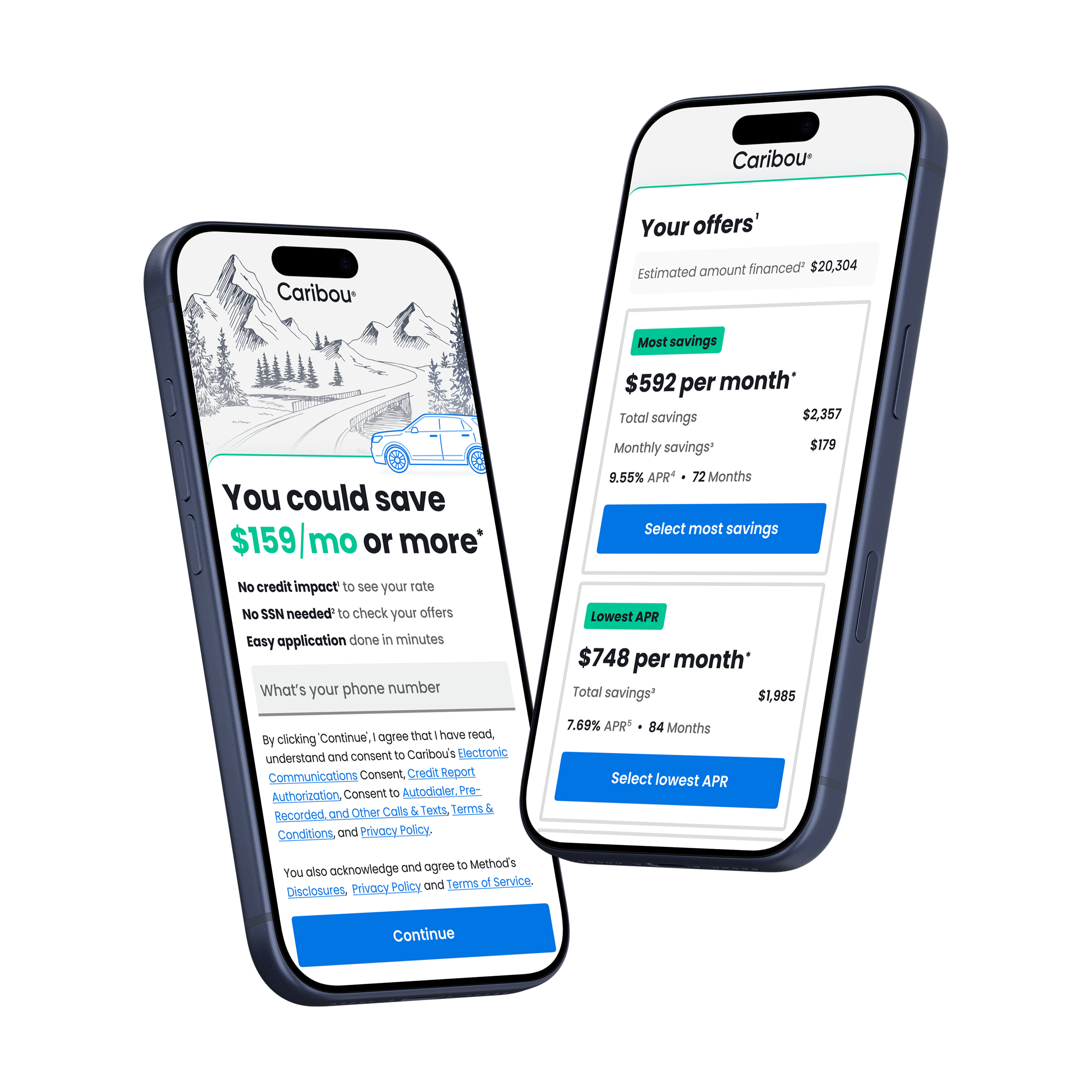
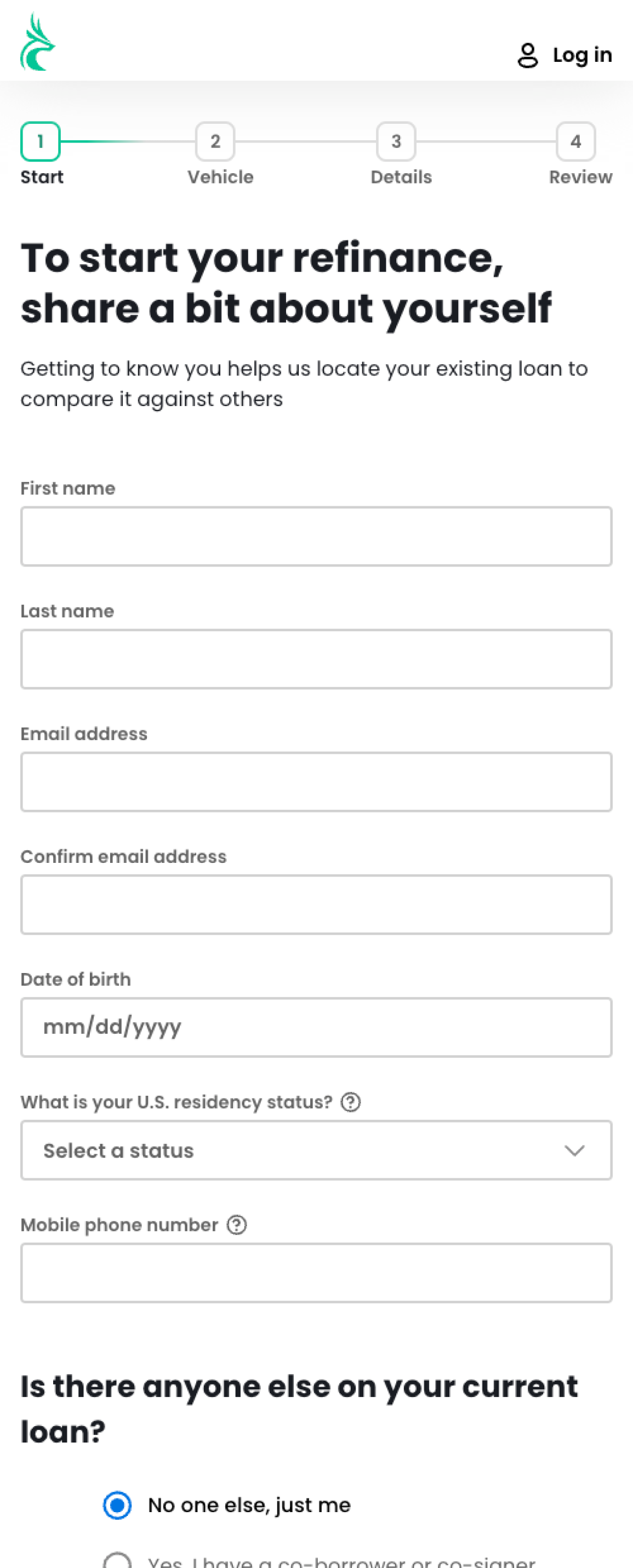
The redesign restructured the flow around three architectural changes: replacing email authentication with phone verification, introducing third-party prefill with validated fallback paths, and rebuilding the multi-page form as a single-direction wizard with one primary action per step.
Phone authentication replaced email because 80% of users completed the journey on mobile. Phone was the natural session-continuation path and eliminated the re-entry friction that email interruption created.
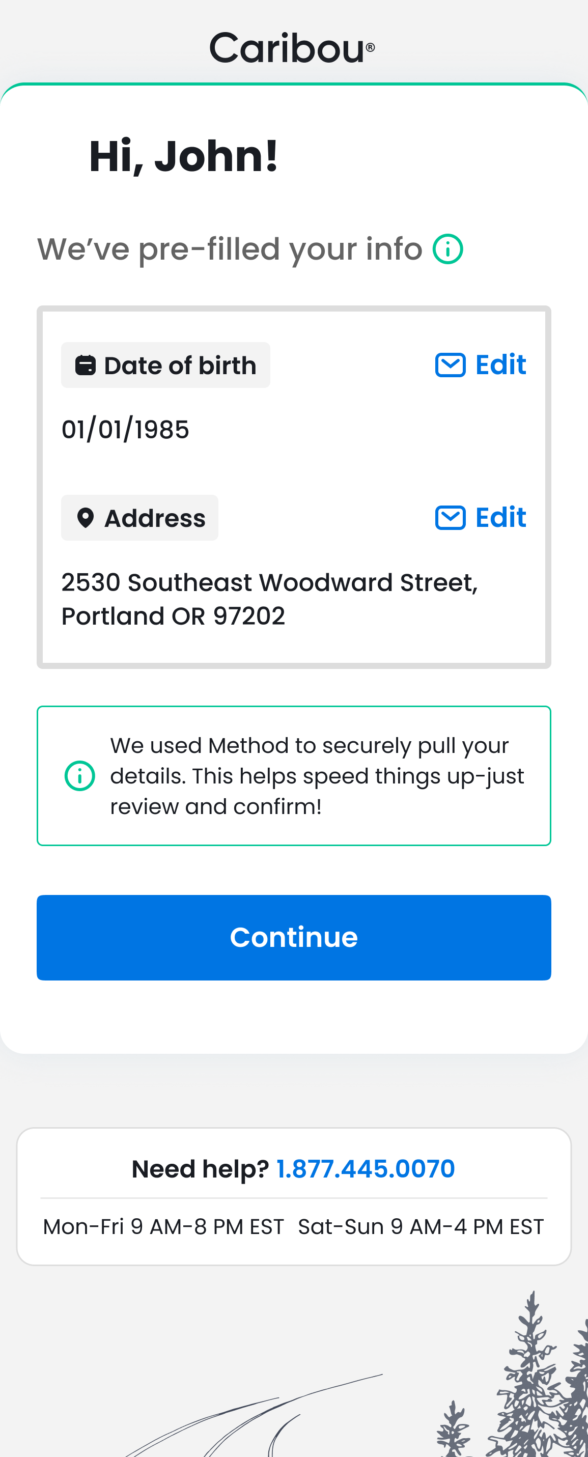
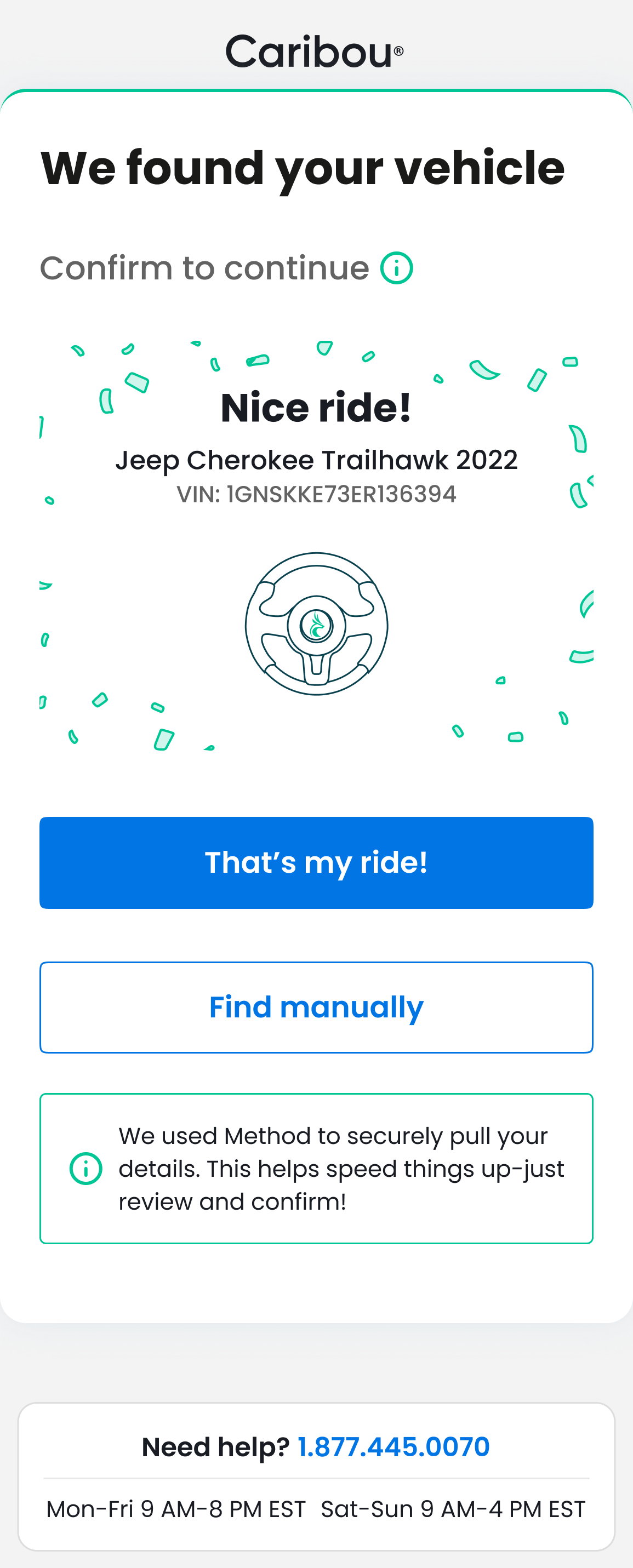
Prefill addressed the manual data entry burden at the identity and vehicle steps. Rather than presenting prefill results as a completed form, I designed a confirmation model where users review and verify prefilled data before advancing. This preserved user trust and regulatory compliance without restoring the friction of manual entry.
The wizard flow replaced the multi-page sequential form by reducing each step to a single decision or data point, with progress implicit in forward movement rather than explicitly tracked. Removing the progress bar removed the visual representation of remaining effort, which testing showed increased rather than reduced perceived complexity.
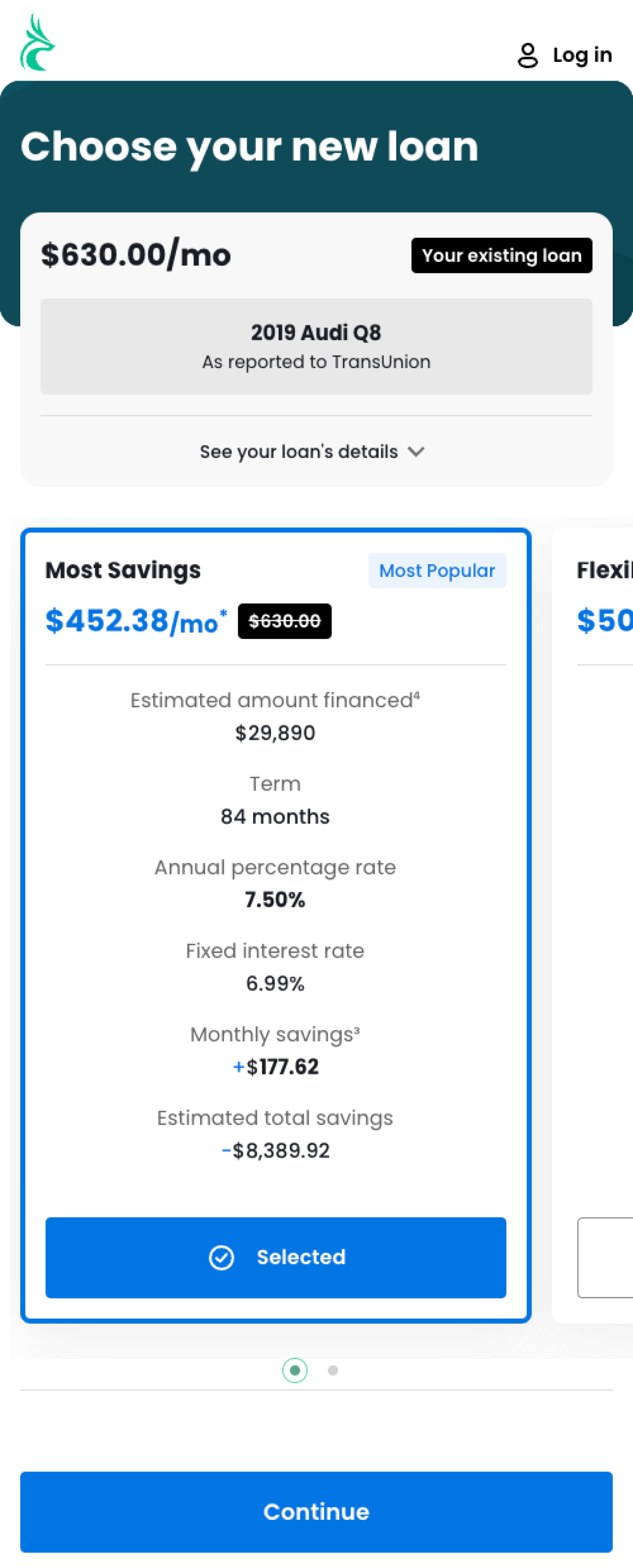
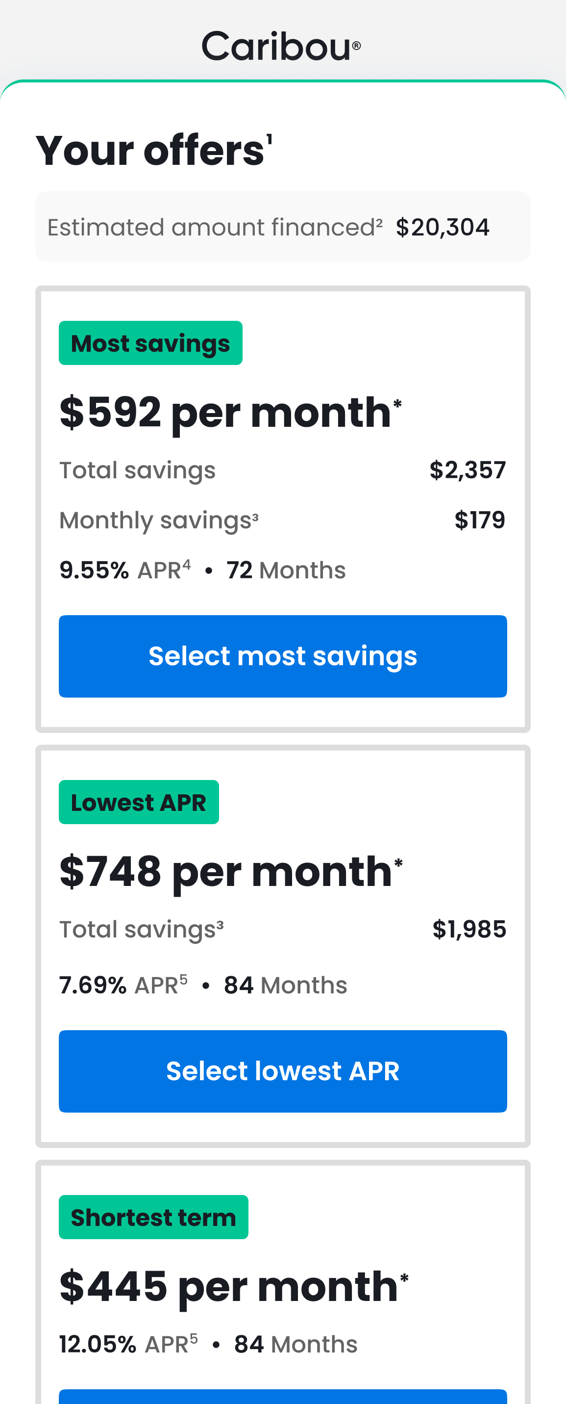
Offer Selection
The original offer selection page presented multiple rate and term combinations in a dense comparison layout. I simplified this to surface the most relevant offer by default with clear terms, moving secondary options to an expandable section. Upfront clarity reduced decision paralysis without removing user control over offer selection.
Before
After
Prefill Accuracy and Fallback
I worked with engineering and the third-party prefill vendor to define API requirements and validation layers. Prefill results pass through field-level validation before presentation. When confidence thresholds are not met or data is unavailable, fallback fields are surfaced inline without exposing the vendor failure to the user. The trust model keeps the user experience consistent regardless of prefill reliability.
Personal Information
Vehicle Match
Landing Page and Mobile Optimization
Streamlined the landing page to a single value proposition and a clear entry point, removing footer elements, trust mark clusters, and explanatory sections that added scroll depth without improving conversion. Visual design was produced in collaboration with a visual designer based on my UX specifications and component direction.
Before
After
Production
MVP launched in April 2025. I collaborated with the PM, engineering, analytics, and legal teams throughout. The implementation used Rails and React-Bootstrap. I worked with engineering to optimize component structure for load performance on mobile connections, where the original flow had measurable rendering delays that contributed to early drop-off.
Post-launch analytics confirmed the conversion lift was concentrated at the two targeted drop-off points: identity verification and offer selection. This validated that the architectural changes addressed the actual friction rather than surfacing new ones. Partner channel improvement was a secondary outcome driven by the same flow changes applied across acquisition paths.
Decisions & Trade-offs
- Phone authentication vs. email authentication: Phone replaced email because the user base was overwhelmingly mobile. Email authentication required leaving the browser session, retrieving a link, and re-entering: a three-step interruption that did not match how mobile users experience session continuity. The trade-off was a marginally higher friction entry for the small share of desktop-primary users, which analytics confirmed was not a meaningful conversion cost.
- Prefill accuracy vs. user trust: Third-party prefill introduces data reliability variance. Rather than suppressing prefill when confidence was low or showing errors to users, validation layers and fallback paths were designed to absorb vendor risk internally.
- Progress bar and trust mark removal: Removing both ran counter to standard conversion conventions. The decision was grounded in competitive research and user testing that showed both elements increased perceived complexity for users already committed to the process. Users interpreting trust marks as signals of risk rather than reassurance was the specific finding that justified removal.
- Simplified offer review vs. full comparison: Reducing the default offer view removed some comparison transparency. Upfront rate and term clarity compensated for this, with access to secondary options retained. The trade-off prioritized decision speed over exhaustive comparison for a flow where most users had already narrowed their intent before arriving.
- Wizard flow vs. multi-page form: Breaking the form into single-step wizard screens added perceived flow length in terms of step count while reducing perceived complexity per step. Testing confirmed that users experienced single-decision steps as faster even when total step count was higher. The cognitive load reduction outweighed the additional navigation.
Synthesis
The original flow was functional. The problem was architectural: friction accumulated at every point where a desktop session model diverged from mobile behavior. What made the redesign durable was the sequence of work: regulatory and technical constraints were resolved before design decisions were finalized, which meant each architectural change was grounded in what was actually possible rather than what was theoretically optimal.
That approach reflects how I work across regulated product environments: constraints are inputs to the design problem, not obstacles around it. The conversion gains held because the architecture was shaped by what compliance, engineering, and vendor reliability would actually support.
Next Project

Back to Work
Auto Refinance Conversion Redesign
Caribou Financial
Mobile first re-architecture increasing view to submit conversion by 57%
Executive Summary
Caribou's refinance flow had been built for desktop while the majority of users were arriving on mobile. The experience was structured around a desktop session model (multi-field forms, sequential pages, and an email-based authentication step) which introduced friction at every point where mobile behavior diverged from that assumption. Organic traffic converted poorly, users dropped off before reaching offer selection, and the funnel depended heavily on partner-acquired leads to sustain submission volume.
I led strategy, system architecture, and cross-functional alignment across design, engineering, analytics, compliance, and legal. The redesign introduced phone authentication and third-party data prefill to remove the two highest friction points, rebuilt the flow as a mobile-first wizard, and restructured the offer presentation to reduce decision load. The result was a 57% increase in view-to-submit conversion and a seven-figure projected annual revenue impact from organic traffic.
Overview
Over 80% of users arrived on mobile. The flow required excessive scrolling, frequent field switching, and an email authentication step that interrupted the session and caused drop-off before users re-entered the funnel.
The funnel also lacked prefill capability, requiring users to manually enter information that third-party data sources could supply. Combined with the email authentication interruption, this produced high abandonment rates at the identity and vehicle verification steps.
The redesign was scoped to address the mobile usability gap and the organic conversion problem as a single architectural change.
- Supported Devices: Mobile-first, full desktop support
- Timeline: Dec 2024 – Sep 2025 (MVP launched Apr 2025)
- Primary Audience: Organic search users, partner traffic, returning customers
These challenges weren't isolated symptoms - they were structurally interconnected. This table maps how each phase addressed a distinct layer of the problem:
Layer
Impact
Focus Area
Key Signals
Framing
Quantified revenue leakage and structural acquisition risk
Conversion Risk & Funnel Leakage
Home / Offers / SSN drop-offs; Partner reliance vs. organic; 80% mobile misalignment
Discovery
Identified cognitive overload, trust breakdown, and step fatigue drivers
Root Cause Validation
Analytics segmentation; Loan officer insights; User testing + competitor benchmarking
Design
Scalable, compliant, cross-channel conversion system
Conversion System Architecture
Wizard flow + progress; Variant testing at drop-offs; Pre-fill + fallback + auth trade-offs
Production
Durable infrastructure enabling sustainable growth and future AI extensibility
Platform Operationalization
MVP launch + QE; Rails + React-Bootstrap alignment; API dependency + design system + debt reduction
Discovery
Research & Synthesis
In collaboration with the project manager, I conducted user interviews with participants who had recent refinance experience to understand motivations, expectations, and financial decision-making behavior. The interviews revealed higher financial literacy than anticipated. Users arrived with rate and term awareness and were not relying on the flow for education. This finding supported removing explanatory copy and tooltips that added length without adding value for the actual audience.
Analytics segmentation identified three primary drop-off points: the landing page before form entry, the identity verification step, and the offer selection page. Loan officer interviews confirmed that users who reached agents were frequently asking questions that the flow should have preempted, pointing to information hierarchy problems rather than comprehension gaps.
Flow Variant Analysis
I tested flow variations across landing page structure, offer and product presentation, and review page inclusion. Competitive benchmarking surfaced a consistent pattern in higher-converting flows: removal of progress bars and trust mark clusters. Testing confirmed this held for Caribou's audience. Both elements anchored user attention to process length and complexity rather than forward momentum, adding friction for users who had already decided to apply. Both were removed despite their presence in standard conversion conventions.
UX Flow Workshop
I facilitated a whiteboarding session with the VP of Product to map the end-to-end flow, data requirements, prefill logic, and fallback paths. The session translated research findings into a streamlined architecture and established the wizard-based flow structure, phone authentication entry point, and prefill-with-fallback strategy that became the foundation for the redesign.
Architecture & Data Mapping
Design
Core Architecture Decisions
The redesign restructured the flow around three architectural changes: replacing email authentication with phone verification, introducing third-party prefill with validated fallback paths, and rebuilding the multi-page form as a single-direction wizard with one primary action per step.
Phone authentication replaced email because 80% of users completed the journey on mobile. Phone was the natural session-continuation path and eliminated the re-entry friction that email interruption created.
Prefill addressed the manual data entry burden at the identity and vehicle steps. Rather than presenting prefill results as a completed form, I designed a confirmation model where users review and verify prefilled data before advancing. This preserved user trust and regulatory compliance without restoring the friction of manual entry.
The wizard flow replaced the multi-page sequential form by reducing each step to a single decision or data point, with progress implicit in forward movement rather than explicitly tracked. Removing the progress bar removed the visual representation of remaining effort, which testing showed increased rather than reduced perceived complexity.
Offer Selection
The original offer selection page presented multiple rate and term combinations in a dense comparison layout. I simplified this to surface the most relevant offer by default with clear terms, moving secondary options to an expandable section. Upfront clarity reduced decision paralysis without removing user control over offer selection.
Before
After
Prefill Accuracy and Fallback
I worked with engineering and the third-party prefill vendor to define API requirements and validation layers. Prefill results pass through field-level validation before presentation. When confidence thresholds are not met or data is unavailable, fallback fields are surfaced inline without exposing the vendor failure to the user. The trust model keeps the user experience consistent regardless of prefill reliability.
Personal Information
Vehicle Match
Landing Page and Mobile Optimization
Streamlined the landing page to a single value proposition and a clear entry point, removing footer elements, trust mark clusters, and explanatory sections that added scroll depth without improving conversion. Visual design was produced in collaboration with a visual designer based on my UX specifications and component direction.
Before
After
Production
MVP launched in April 2025. I collaborated with the PM, engineering, analytics, and legal teams throughout. The implementation used Rails and React-Bootstrap. I worked with engineering to optimize component structure for load performance on mobile connections, where the original flow had measurable rendering delays that contributed to early drop-off.
Post-launch analytics confirmed the conversion lift was concentrated at the two targeted drop-off points: identity verification and offer selection. This validated that the architectural changes addressed the actual friction rather than surfacing new ones. Partner channel improvement was a secondary outcome driven by the same flow changes applied across acquisition paths.
Decisions & Trade-offs
- Phone authentication vs. email authentication: Phone replaced email because the user base was overwhelmingly mobile. Email authentication required leaving the browser session, retrieving a link, and re-entering: a three-step interruption that did not match how mobile users experience session continuity. The trade-off was a marginally higher friction entry for the small share of desktop-primary users, which analytics confirmed was not a meaningful conversion cost.
- Prefill accuracy vs. user trust: Third-party prefill introduces data reliability variance. Rather than suppressing prefill when confidence was low or showing errors to users, validation layers and fallback paths were designed to absorb vendor risk internally.
- Progress bar and trust mark removal: Removing both ran counter to standard conversion conventions. The decision was grounded in competitive research and user testing that showed both elements increased perceived complexity for users already committed to the process. Users interpreting trust marks as signals of risk rather than reassurance was the specific finding that justified removal.
- Simplified offer review vs. full comparison: Reducing the default offer view removed some comparison transparency. Upfront rate and term clarity compensated for this, with access to secondary options retained. The trade-off prioritized decision speed over exhaustive comparison for a flow where most users had already narrowed their intent before arriving.
- Wizard flow vs. multi-page form: Breaking the form into single-step wizard screens added perceived flow length in terms of step count while reducing perceived complexity per step. Testing confirmed that users experienced single-decision steps as faster even when total step count was higher. The cognitive load reduction outweighed the additional navigation.
Synthesis
The original flow was functional. The problem was architectural: friction accumulated at every point where a desktop session model diverged from mobile behavior. What made the redesign durable was the sequence of work: regulatory and technical constraints were resolved before design decisions were finalized, which meant each architectural change was grounded in what was actually possible rather than what was theoretically optimal.
That approach reflects how I work across regulated product environments: constraints are inputs to the design problem, not obstacles around it. The conversion gains held because the architecture was shaped by what compliance, engineering, and vendor reliability would actually support.
Next Project
Measured Impact
Seven-figure projected annual revenue impactStrengthened sustainable organic growth as higher-converting traffic compounded across both channels.
+57% view-to-submit conversionImproved organic funnel efficiency by eliminating the primary drop-off points in the mobile flow.
+40–60% lift across partner channelsIncreased cross-channel conversion consistency by applying the same flow improvements to partner traffic.
Hundreds of incremental submissions per monthReduced reliance on partner-acquired leads by shifting volume toward a stronger organic funnel.